Discover the secrets of color in your home and turn your place into an irresistible retreat. A complete guide to cozy tones, color psychology, and practical tips for creating a home with soul.
Have you ever walked into a house and felt, without quite knowing why, that you could happily live there forever? It isn’t just the tidiness or the expensive furniture. It’s something subtler, something that wraps around you. Here’s a hint: most of the time, the secret is in the colors.
We often underestimate how much walls and textiles influence our mood. Think about it, though. How do you feel in a white hospital room compared to a wood cabin in earth tones? The answer is instant. In this post, I want to pour out everything I’ve learned about using color to inject warmth, peace, and that spark of joy we’re all looking for when we get home after an exhausting day.
Why is color the soul of your home?
Before we go grabbing paint cans like maniacs, I want you to pause for a second and feel. Color isn’t just aesthetics, it’s pure vibration. In my experience, when you choose a color based only on what’s “trending,” you risk ending up in a home that looks like a cold, lifeless catalog.
To create a cozy home, we need to connect with our own energy. Ask yourself what makes you feel safe. Which tones help you slow down? Color acts directly on the nervous system. The right shades can lower your cortisol levels (the stress hormone) and boost your sense of security.
Color psychology applied to well-being
You don’t need to be an expert to understand that color communicates feelings, though it does help to know what each family “says” so you don’t miss the mark. For example:
- Earth tones anchor us to the ground and give us stability.
- Soft blues invite us to breathe deeply and unwind.
- Toasted yellows and mustards give us that spark of sunny joy without ever getting loud.
Have you noticed how your mood shifts depending on the light coming through the window and how it bounces off the walls? That’s what we’re going to learn to master today.
The foundation of everything: neutrals that aren’t boring
A lot of people are scared of neutrals because they think their home will look bland. Nothing could be further from the truth! The trick is choosing the right undertone. Forget pure office white. What we want here is texture and warmth.
The reign of greige: the perfect balance
If one color has revolutionized cozy decorating in recent years, it’s greige. It’s that delicious mix of gray and beige. Why does it work so well? Because it has the elegance of gray with the warmth of beige.
It’s the ideal color if you get lots of natural light but don’t want the room to feel cold. In my living room, for instance, greige was a total before and after. It goes with everything: with wood, with natural fibers like wicker, and with any accent color you want to add later.
Off-white and sand: cozy light
If your home is small or doesn’t get much light, off-white is your best ally. Unlike stark white, off-white carries a hint of ocher or gray that softens the way light bounces around. It creates a clean atmosphere with a note of softness that invites you to relax.
Have you ever tried a sand color? It’s a tone that evokes the beach and the calm of summer, yet it works incredibly well in winter when you pair it with wool throws and rich textures.
Earth tones: connecting with nature from the couch
For a home to feel truly cozy, we need to bring a little of the outdoors inside. Earth tones are, by definition, the colors of welcome.
Terracotta and rust: the fire of home
Terracotta vibrates with a very special energy. It reminds me of clay, of old country houses, of things made by hand. Using terracotta on an accent wall, or even in your bedding, can radically change the visual temperature of a room.
Don’t these tones feel like they carry something of an old family home? They never go out of style because they’re tied to the earth itself. If their intensity scares you a little, try them in pillows or a rug first. You’ll see how the mood shifts.
Forest and olive greens: the breather you need
We couldn’t talk about warmth without mentioning green. Careful, though, not just any green. I’m talking about deep greens, the ones that remind you of a walk in the woods. Olive green in particular has a yellow base that makes it extremely cozy.
A bedroom in dark olive green is, to me, the height of peace. It wraps around you in a way that makes you feel protected, like you’re in a nest. Green is also the color that rests the human eye the most. Is there anything cozier than stopping the strain and simply being?
The living room: the heart where everything happens
The living room is probably where we spend the most waking hours. It’s where we laugh, where we watch the show we’re hooked on, and where we welcome the people we love. That’s why color here has to be versatile and, above all, generous.
The magic of mustard and ocher tones
If you want your living room to radiate vitality without losing comfort, mustard is your color. I’m not talking about a screaming yellow, but about that deep ocher that seems to hold onto sunlight even after dark.
In my experience, mustard works like a magnet for joy. If you have a sofa in gray or neutral tones, adding a couple of armchairs or a throw in this shade takes the space from “pretty” to “vibrant.” You know that feeling of walking into a room and sensing immediate warmth? That’s ocher doing its job.
Deep blues for sophisticated living rooms
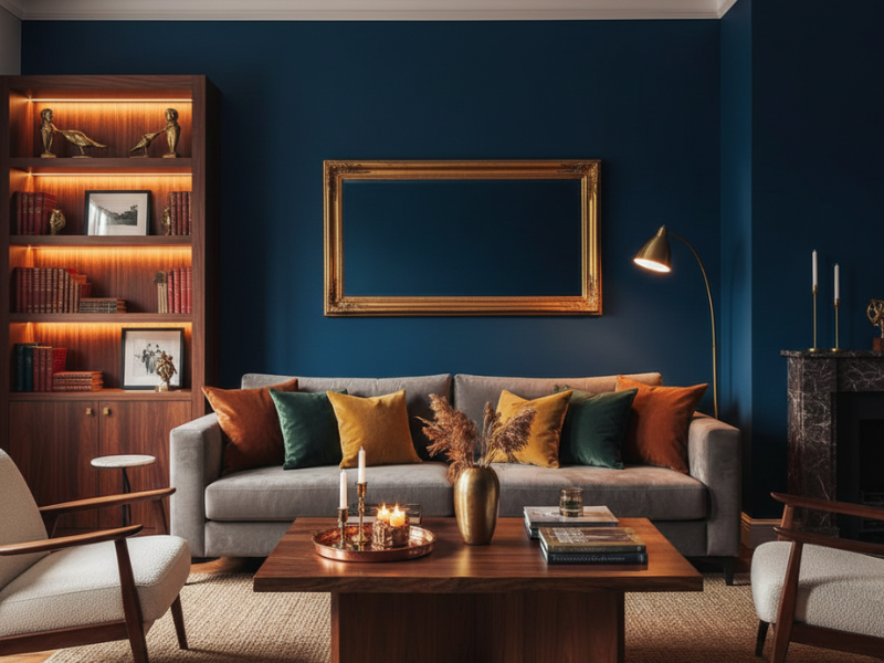
Many people think blue is a cold color, and it can be if you pick a very pale sky blue in a room with little light. Once you move into navy or teal, though, the whole story changes.
A living room with one deep blue wall creates a sense of infinite depth. It’s a color that invites slow conversation and reading. Combine it with dark woods and details in gold or copper, and the result is a cozy atmosphere with a touch of elegance that leaves you speechless.
The bedroom: your sanctuary for switching off
The rules shift a bit here. In the living room we’re after togetherness, while in the bedroom we’re after visual silence. Color in here has to be like a whisper telling you it’s okay to set down everything the day handed you.
Dusty pink: sweetness and calm
Please, let’s get it out of our heads that pink is only for kids’ rooms. Dusty pink, or “nude,” is one of the most sophisticated and relaxing colors out there. It has a grayish base that makes it feel very grown-up.
Painting a bedroom this color is like living inside a cloud at sunset. It’s a tone that softens your features, makes bedside lamplight look warmer, and psychologically helps you let your guard down. Isn’t that exactly what we all want as we head to bed?
Warm grays: the embrace of stone
If you’re someone who prefers a more minimalist style, stone gray is your best choice. Unlike bluish gray (which can feel icy), warm gray carries notes of brown or violet.
It’s a color that wraps around you without weighing you down. It pairs beautifully with white linen sheets and light wood floors. It’s the perfect backdrop for your mind to rest, free of distractions, letting you drop into deep sleep much faster.
The importance of lighting: color is light
This is where a lot of people get frustrated. You buy a can of paint that looked gorgeous in the store, you put it on your wall, and, horror, it looks nothing like it did. Why does this happen? Because color is basically reflected light.
Natural light vs. artificial light
North light is bluer and cooler, so colors tend to look more muted. If your room faces north, you need colors with a warm base (yellows, reds, oranges) to compensate.
South light, by contrast, is intense and yellow. Here you can afford cooler colors like greens or blues, because the sun already takes care of warming them up.
The sample trick (don’t skip this one)
I know you’re eager to see the final result, but for the love of everything, test your colors. Paint a square at least 20 by 20 inches on different walls in the room. Look at it in the morning, in the afternoon, and above all at night with the lamps on.
Whichever color you love through all those phases is the winner. It’s a slower process, sure, but I promise it saves you disappointment and a lot of money.
How do you combine colors without fear of messing up?
Sometimes we love a color but have no idea what to pair it with. Here are three golden rules that never fail for keeping things cozy:
- The 60-30-10 rule: 60% of the room should be a dominant color (usually the most neutral one), 30% a secondary color (furniture, curtains), and 10% an accent color (pillows, art, vases).
- Tone on tone: Pick a color you love and use different intensities of it. For example, a dark beige wall, a cream sofa, and sand-colored pillows. It’s impossible to get wrong and the sense of harmony is complete.
- A touch of contrast: If everything is too flat, the eye gets bored. One small hit of a complementary color (a piece of art with some orange in a blue room, say) makes all the other colors wake up.
Materials that amplify color
We can’t separate color from texture. Red on a smooth, glossy wall can feel aggressive, while that same red in a wool rug or on exposed brick is pure warmth.
For your home to feel cozy, colors need to go hand in hand with honest materials:
- Wood: warms up any cool color instantly.
- Natural fibers (wicker, jute, rattan): bring an organic texture that makes color feel more alive.
- Wool and velvet: absorb light in a way that makes colors look deeper and richer.
The kitchen: where love (and color) gets cooked up
Kitchens have traditionally been painted white for that sense of hygiene. Let’s be honest, though, an immaculate white kitchen can start to feel like a lab. If we want the kitchen to be where people gather to chat over a glass of wine, we have to give it some warmth.
Sage greens and soft mints
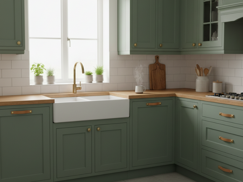
For me, nothing beats green in the kitchen. Sage green, with that dusty gray cast, is wonderful. It reads fresh while also feeling calm and homey. Picture cabinets in this color paired with a light wood countertop and leather or brass pulls. You walk in and time seems to stop.
Green is also tied to nature and fresh food. It opens the appetite in a healthy way and invites us to cook with more presence and care.
Navy blue on the lower cabinets
If your kitchen gets good light and you want to give it overwhelming personality, try painting the base cabinets a deep navy and leaving the uppers white or wood.
Dark blue creates a very solid, cozy visual base. It’s a color that anchors the kitchen to the floor. Add patterned cement tile with a hint of color underfoot and you’ll have a kitchen you never want to leave.
The bathroom: your personal spa in warm colors
The bathroom is usually where we get ready for the day, or where we unwind before bed. Why do it in a cold, bluish environment that makes us look pale in the mirror?
Peach and clay tones for radiant skin
Did you know the color of your bathroom walls affects how you look in the mirror? Paint the bathroom a very cool aqua green and your skin will read gray. Go with peach, soft coral, or even a very washed-out terracotta instead, and the light bouncing onto your face will give you a healthy, warm look.
A bathroom in light earth tones, with organic cotton towels and a plant that tolerates humidity, automatically becomes a retreat. You go from “cleaning up” to “practicing a care ritual.”
Hallways and pass-through spaces: the connecting thread
Hallways often end up as no-man’s-land, yet they’re the glue holding all the rooms together. If the living room is cozy but the hallway is a dark, cold tunnel, the energy breaks.
Enveloping colors for narrow spaces
There’s a myth that narrow hallways always have to be white. I’m here to tell you they don’t! Sometimes painting a hallway a dark, deep color (charcoal gray or midnight blue, for instance) creates a jewel-box effect that turns out to be surprisingly cozy.
If the hallway is dark to begin with, rather than trying to brighten it with a white that will read gray, lean into it. Use a color with character and hang art with good focused lighting. You’ll turn a walkway into a gallery that invites you to take your time.
Common mistakes that kill warmth (and how to avoid them)
Sometimes, with all our good intentions, we make mistakes that keep color from working. Here are the ones I run into most, so you can play it safe:
- Using LED bulbs that are too cool: you can have the warmest wall in the world, but a bluish white bulb will wreck the whole mood. Always look for bulbs between 2700K and 3000K. That’s sunset light, the kind that truly makes colors look cozy.
- Forgetting the ceiling: we paint ceilings white out of pure habit. Have you considered painting yours a shade barely darker than the walls, though? It visually lowers the ceiling and makes the room feel much more gathered, like it’s hugging you.
- Ignoring the floor: the floor is the fifth wall. If you have very cool gray tile, you’ll need a lot more warm elements (wood, wool rugs) to compensate, no matter which wall color you pick.
The power of details: color in small doses
You don’t have to paint the whole house to make it feel cozier. Sometimes the magic lives in the accents.
Color on doors and trim
Painting your doors something other than white is a pro trick that transforms a house completely. Picture doors in a mink gray or a soft olive green against neutral walls. It gives the place a structure and a personality that shouts “someone here pays attention to the details.”
Textiles as visual thermostats
The color of your curtains or pillows is the easiest thing to change and the one with the most direct impact. In winter, you can use pillow covers in rust, mustard, or chocolate brown. In summer, switch to dusty blues or seafoam greens. Color lets your home breathe along with the seasons.
How to build your own custom palette: the emotion method
Forget decorating magazines for a moment. For your home to feel cozy to you, the palette has to come from within. I always recommend these steps so you don’t get lost in a sea of options:
1. Find your “anchor object”
Is there a painting you’re fascinated by? A rug you bought on a trip that you love to touch? Maybe a vase you inherited? Choose an object you already own that makes you feel good. Study its colors, and there’s your starting point. If that object makes you happy, the colors in it will too when they spread across the room.
2. Choose your “target feeling”
Before looking at any paint chips, close your eyes in the room you want to transform. What do you need to feel in there?
- If you need absolute peace, head toward warm neutrals and misty blues.
- If you need energy and creativity, look for terracottas and honey yellows.
- If you’re after security and shelter, chocolate browns and forest greens will be your best friends.
3. The rule of three elements
Don’t overload. For a palette to work without feeling chaotic, try to stay under three main colors. One for the large surfaces (walls), another for the medium elements (sofa, curtains), and a third, the boldest one, for the small details that add sparkle.
The living-dining room: harmony in shared spaces
These days it’s very common to have the living room and dining room in one space. The challenge is using color to separate zones without building walls.
Colorful rugs as islands of warmth
One incredible way to add warmth is to bring color to the floor. A rug in brick or sand tones under the dining table defines that zone and makes it feel far more intimate. In the sofa area, use a different texture in a complementary color. Your eye will read two “micro-homes” inside one room, and that visual organization brings a whole lot of mental calm.
The finishing touch: the color you don’t see (but do feel)
Sometimes the coziest color isn’t in the paint at all, but in the atmosphere we create.
Shadows decorate too
A very common mistake is wanting to light everything evenly. For a color to feel cozy, though, it needs shadows. Shadow is what creates volume and depth. Use table lamps, warm string lights, and candles. Your wall color changes completely when candlelight brushes across it, turning much richer and more alive.
Your action plan for transforming your home today
I know that after reading all this you might feel a little overwhelmed. “I want to do everything!” you’re probably thinking. Relax, we’ll take it step by step:
- Watch the light: tomorrow, drink your coffee while you watch the sun come into your favorite room. Is that light cool or warm? That decides your direction.
- Clear the visual noise: before painting, remove whatever you don’t like. Sometimes the “ugly” color is really just the result of too much clutter competing for attention.
- Buy three samples: don’t grab the big can. Choose three shades you like, paint them on the wall, and live with them for a couple of days.
- Start with textiles: if you’re not ready to commit to paint yet, swap your pillow covers for earth or mustard tones. You’ll see the change immediately, and it will give you the courage for the next step.

Frequently asked questions about color in your home
If I paint a small room a dark color, won’t it look even smaller?
Visually, yes, it may feel a bit more gathered, but here’s the question: are you after openness or after warmth? Sometimes a small, dark room is the coziest place in the world. This is about creating atmosphere, not about gaining imaginary square footage.
How do I tell whether a color is warm or cool if I don’t understand undertones?
An easy trick is to hold the color next to a sheet of pure white paper. You’ll see right away whether it leans blue or gray (cool) or yellow or red (warm).
Can I mix several cozy colors in the same room?
Of course! As long as there’s a logic to it. Mixing different shades from the same family (monochrome) is a sure win. You can also use colors that sit near each other on the color wheel, like green and blue, or orange and red.
Can black be cozy?
Absolutely! Black, used with intention (on a bookcase or window trim, for example), creates a frame that makes every other color pop. It’s like the period at the end of a sentence, giving you confidence and elegance.
My floor is old, cold terrazzo. What color should I choose?
In that case, stay away from cool grays and whites. You need to “warm up” that floor with walls in cream, toasted beige, or even a dry green, plus, of course, plenty of natural fiber rugs!
How do I match wall colors with wood furniture?
If your wood is very red (like cherry), reach for greens or blues to balance it. If it’s light wood (oak or pine), earth tones and off-whites will play up that natural brightness.
We’ve come a long way together in this post. We’ve talked about psychology, light, individual rooms, and feelings. If I want you to walk away with one single idea, it’s this: there are no golden rules, only your own intuition.
Color is the cheapest, most powerful tool you have for changing your life. Yes, really: when you change the environment you wake up in every morning, you’re changing your mood, your energy, and the way you face the world. Your home should be the place where, once you close the door, you feel like everything is okay.
I’d love to know what you thought of this journey through color. Is there a color that brings you peace that we didn’t mention? Are you nervous about taking the plunge with a dark shade? Tell me in the comments! I stop by often to read and reply, because learning from each other is what makes this community so special.
Go ahead and comment, let’s share our experiences creating homes with soul!